Branding
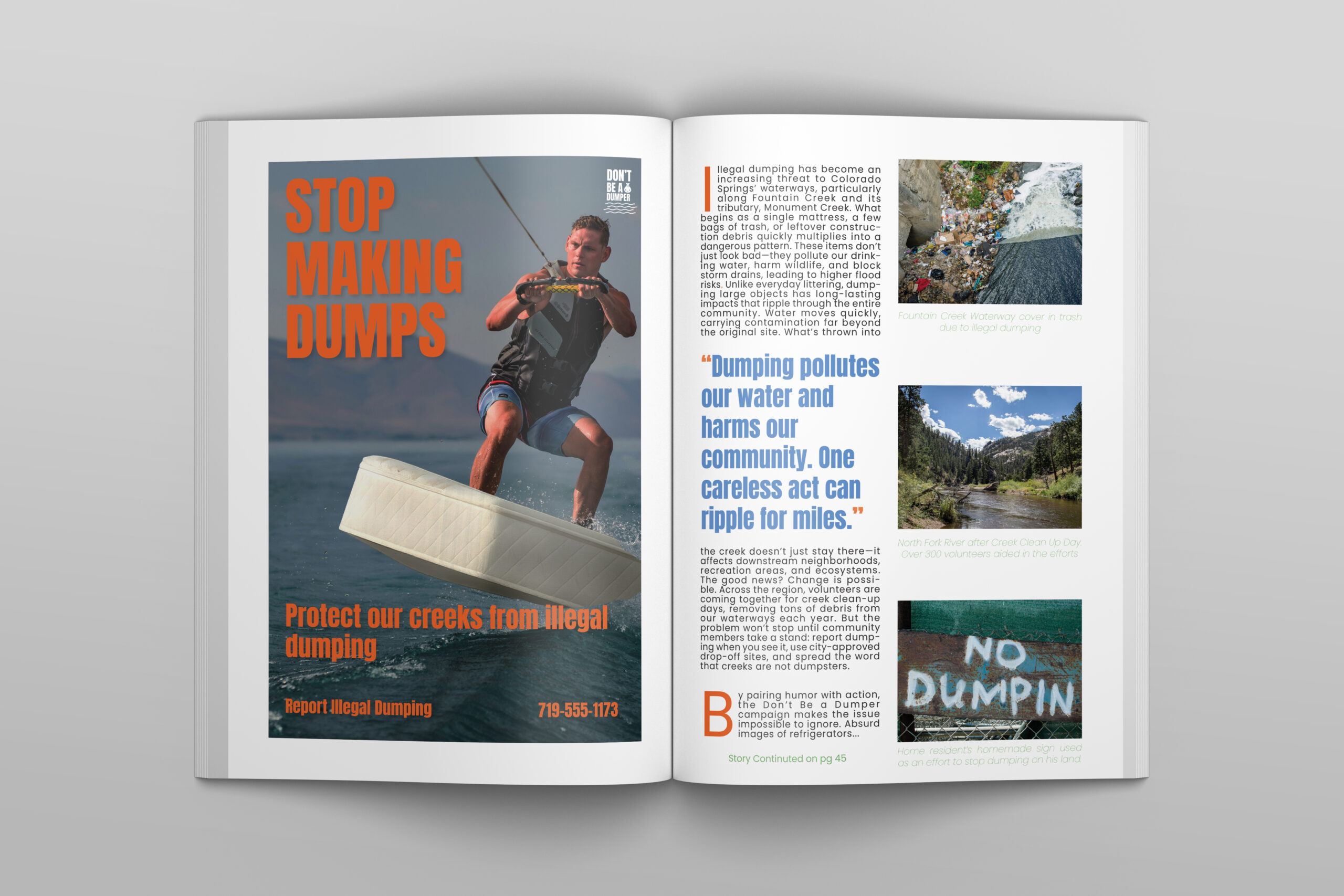
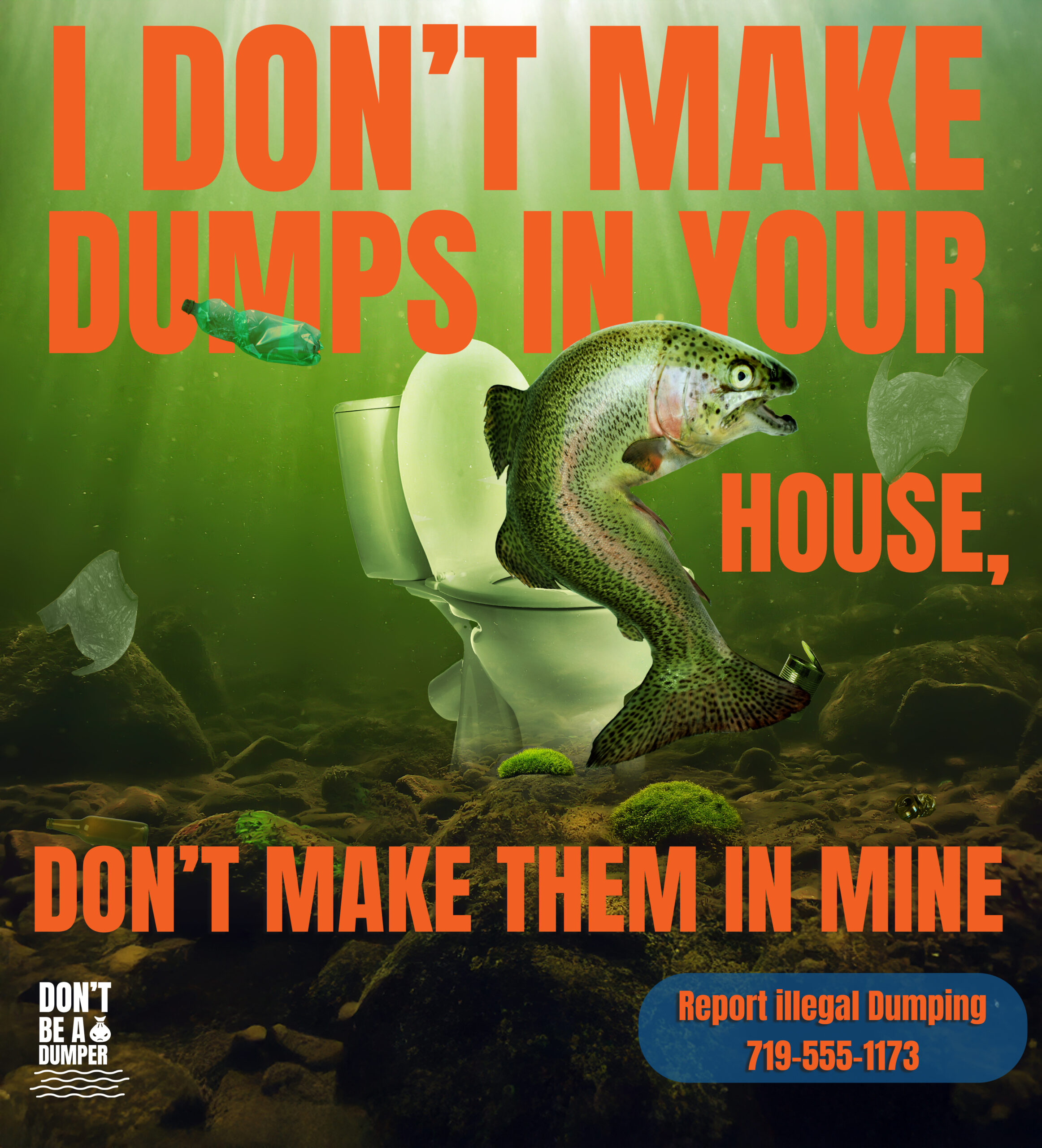
Don’t Be a Dumper
Don’t Be a Dumper was a for fun redesign project that reimagined an existing public awareness campaign in Colorado focused on responsible waste disposal and environmental stewardship. The goal was to explore how refreshed visuals and clearer messaging could make a familiar campaign more engaging and memorable. Using bold, approachable design and strong visual storytelling, the concept balanced education with personality while maintaining the original intent of encouraging positive behavior change.


OT’s in Pelvic health Summit (4th annual)
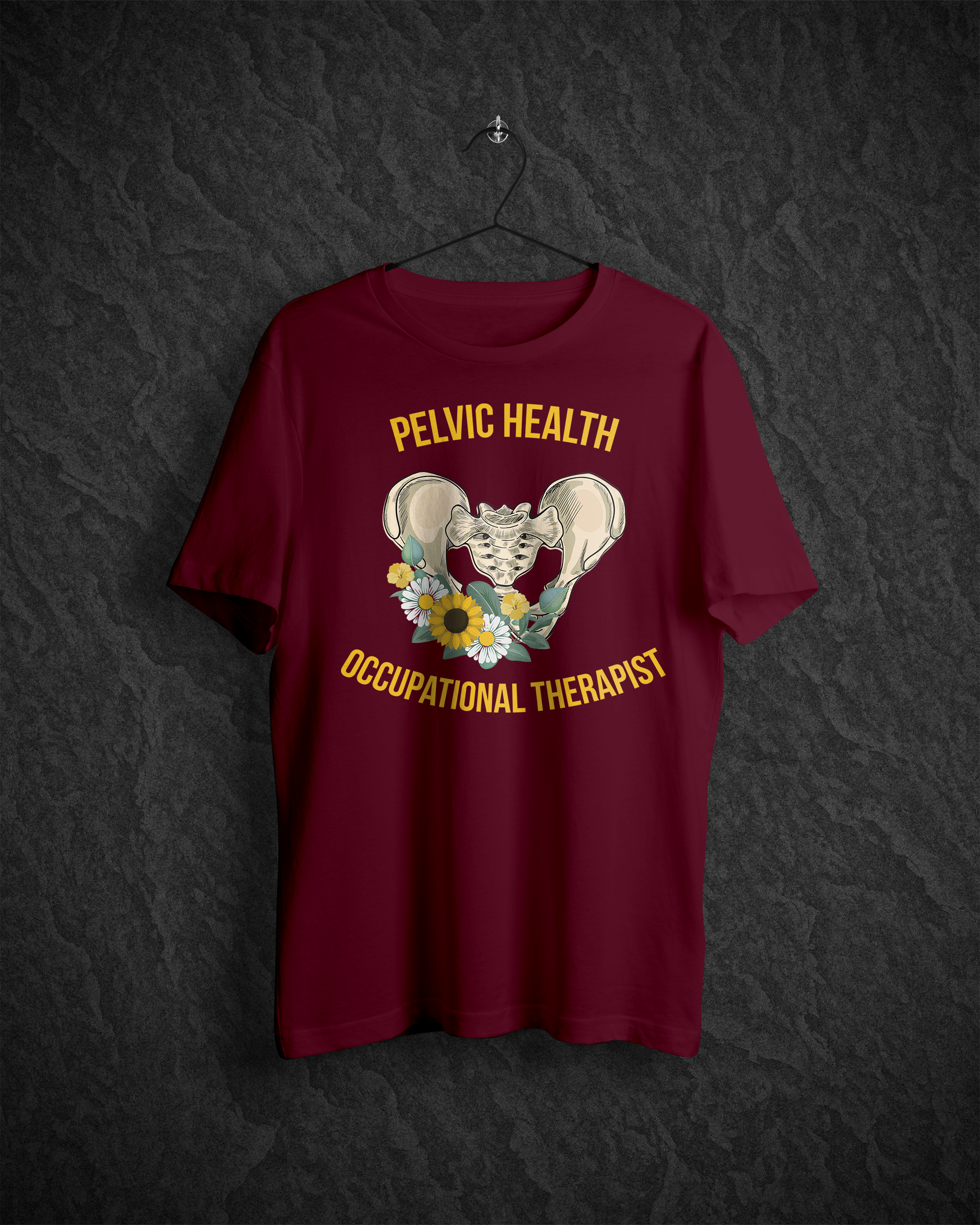
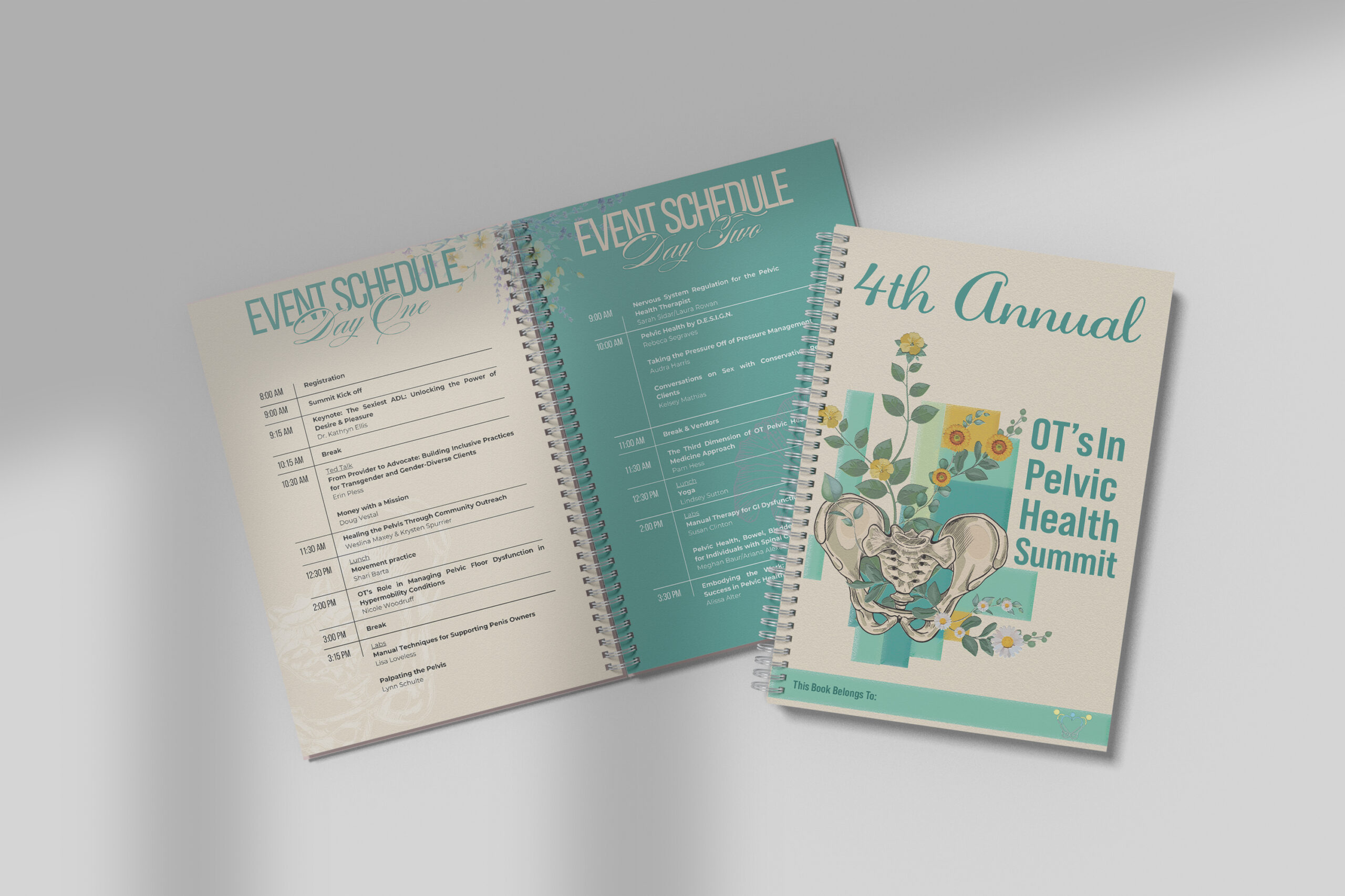
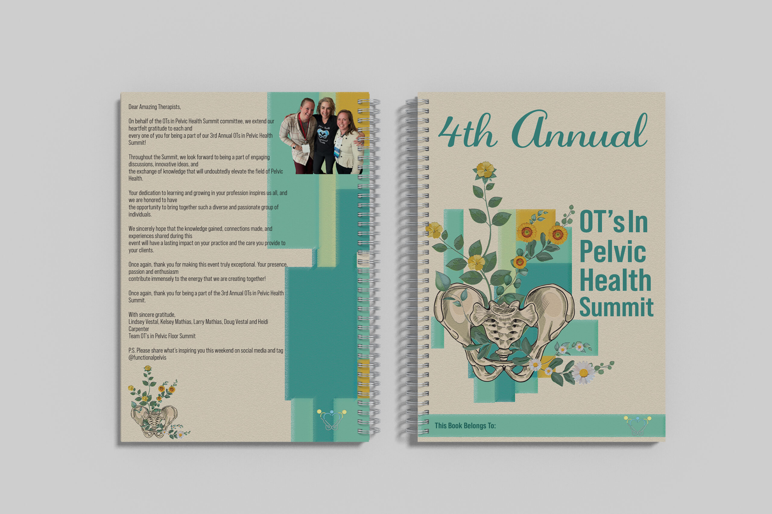
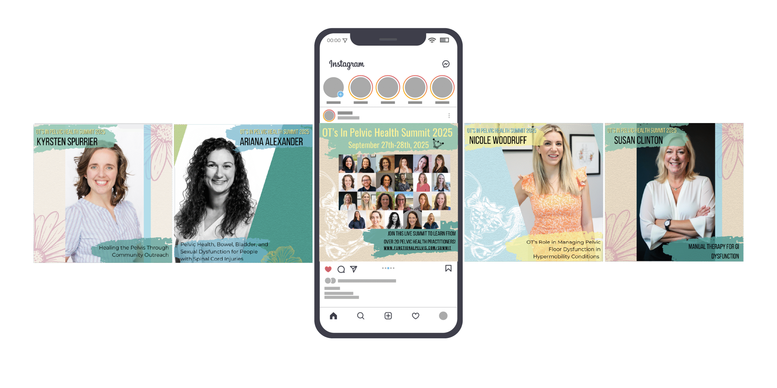
For the Pelvic Health Summit, I developed a cohesive visual identity and full set of conference materials designed specifically for occupational therapists working in pelvic health. The design balances clinical credibility with warmth and approachability, using a floral inspired aesthetic to create an inviting, supportive tone. Assets included social media graphics, signage, t shirts, banners, conference booklets, intro videos, and presentation slide decks, name tags, promotional merchandise (Swag), all unified through consistent typography, color, and layout. The result was a polished, professional system that enhanced the attendee experience while reinforcing the summit’s educational and community focused mission.
The Underwater Traveler
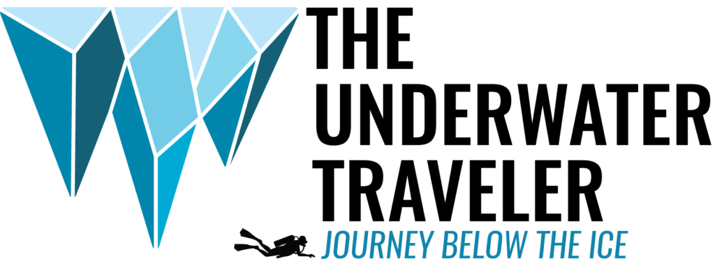
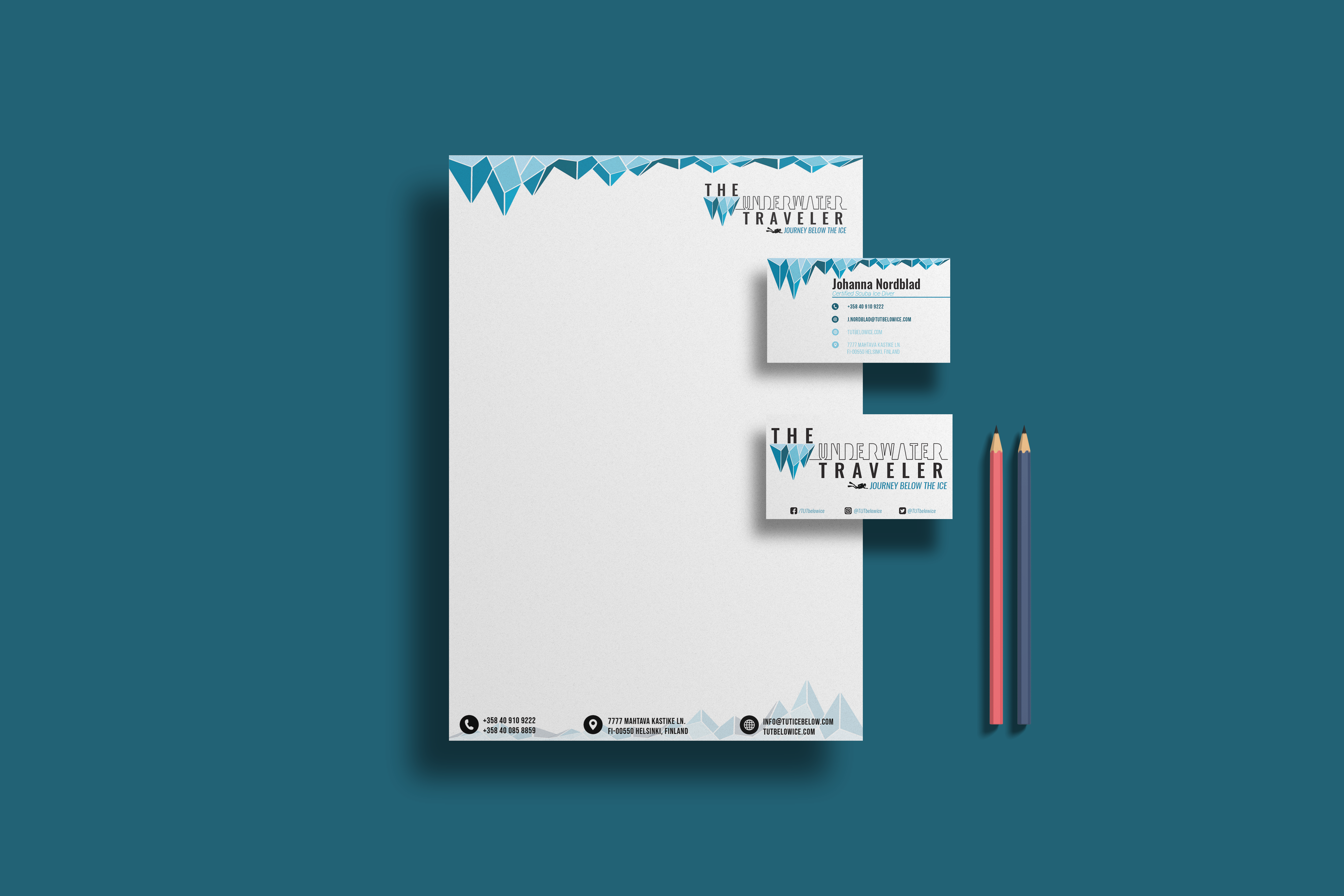
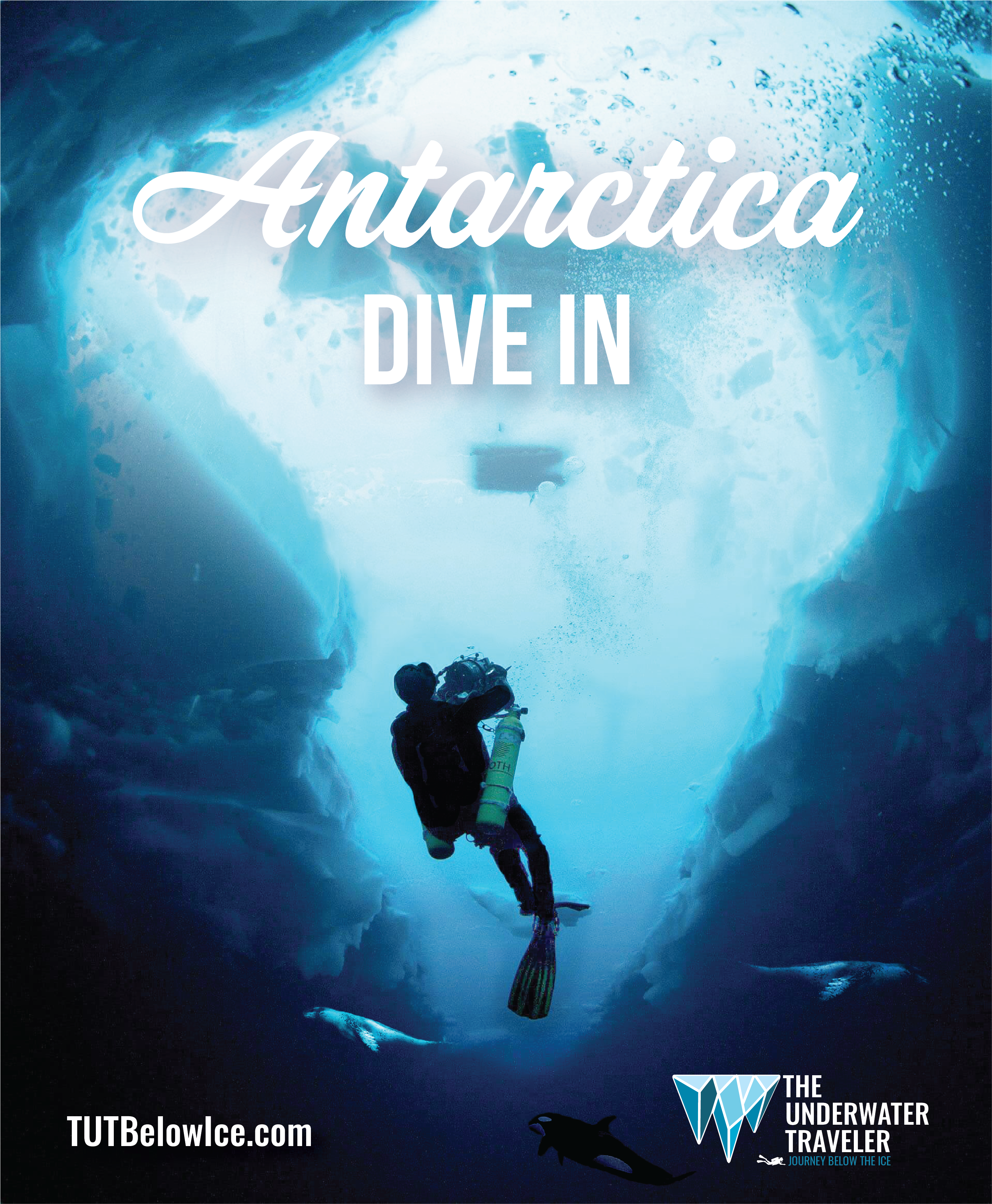
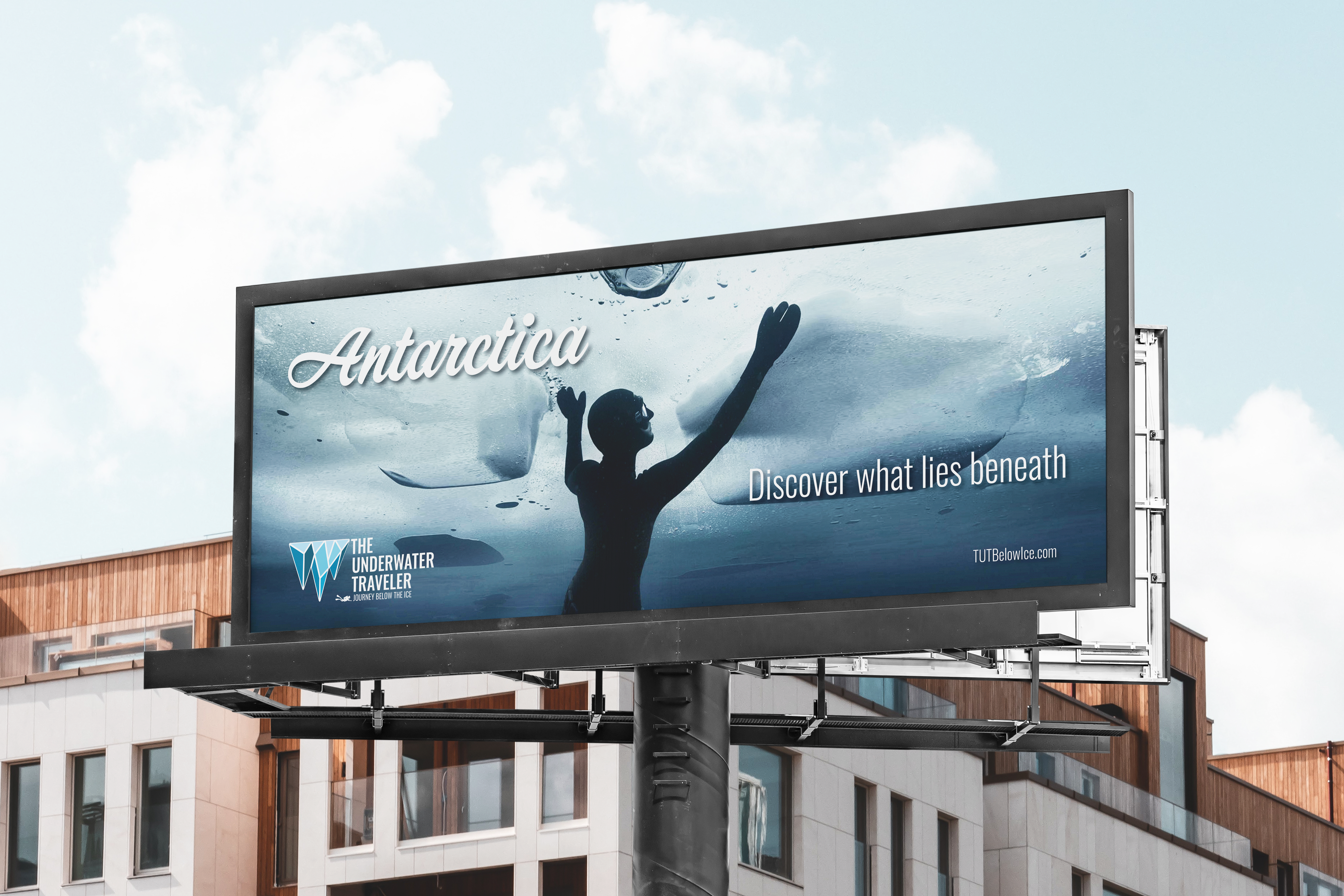
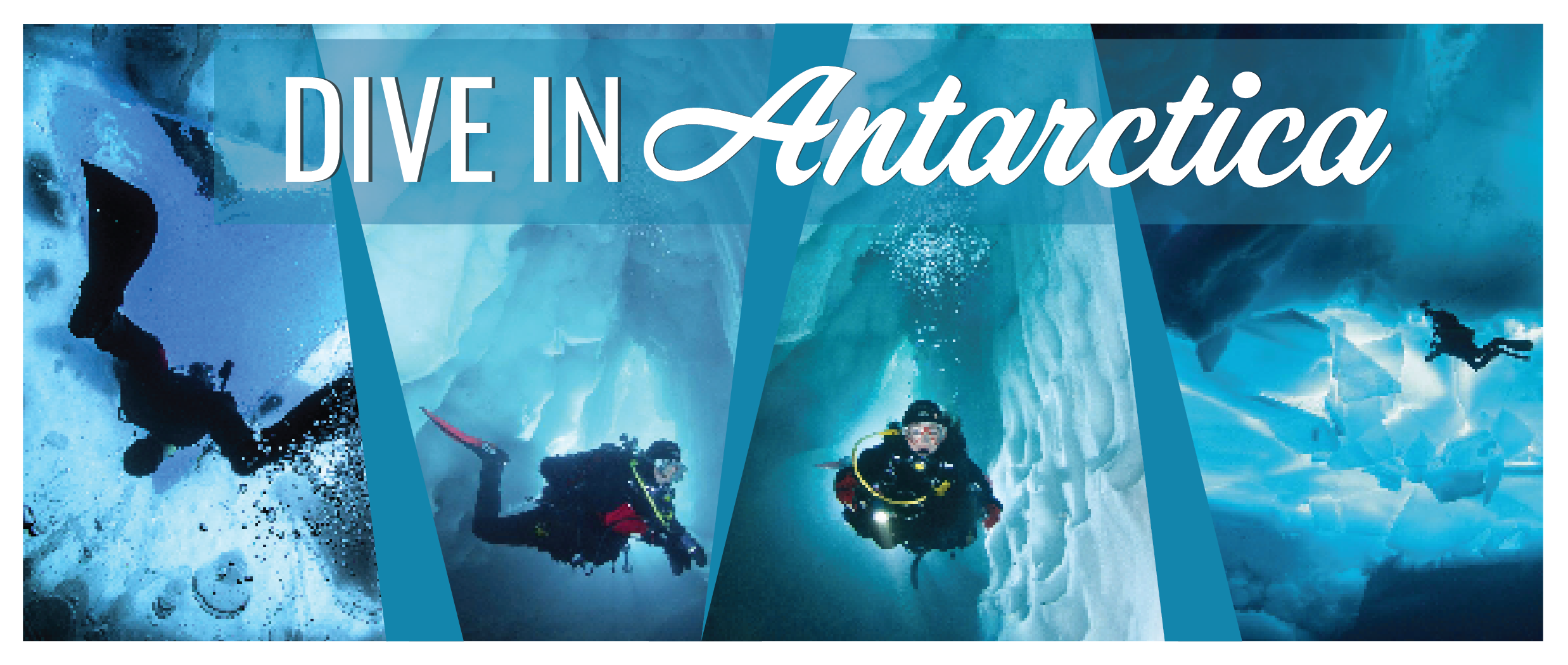
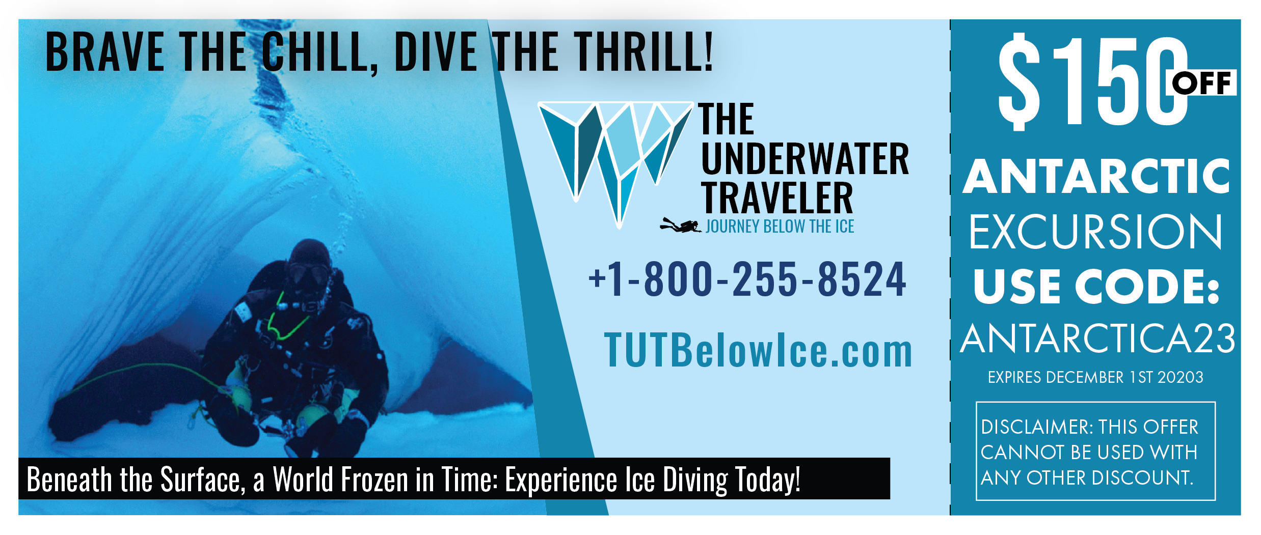
In this class project, I took on the challenge of creating a brand for an ice diving company. From designing a distinctive logo that symbolized the thrill of underwater exploration in icy depths to defining the brand’s values and visual elements, I aimed to capture the essence of the exhilarating world of ice diving. The result is a cohesive brand identity that communicates adventure, courage, and a deep connection with the natural world, providing a captivating representation of the ice diving experience

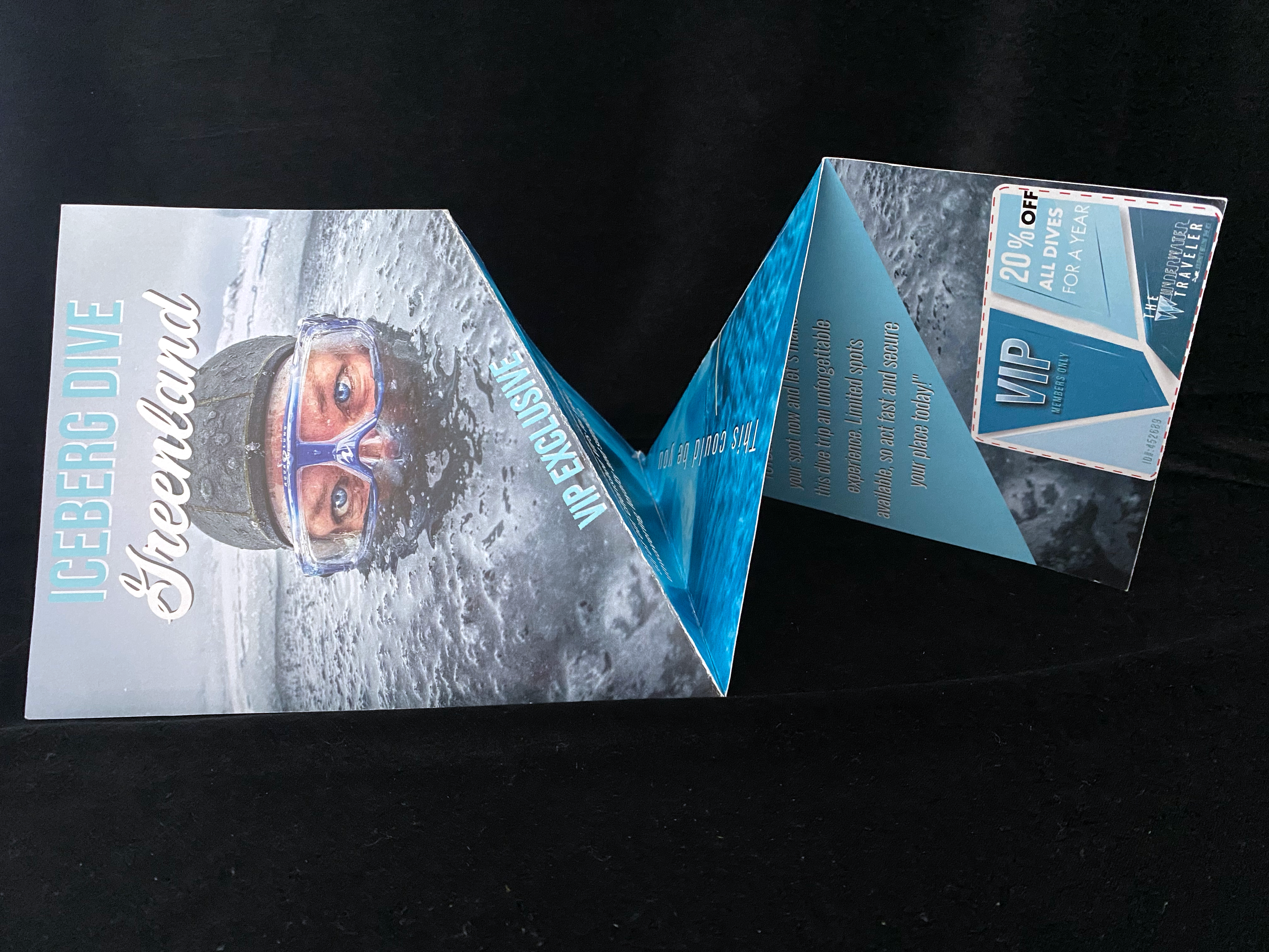
Twisting Accordion Fold Invitation
This was a VIP invite for a members only dive . The fold on this invite is a twisting accordian fold and the panels are triangular. The invitation twists into the full panels you see here. The invite actually folds into postcard size (seen below) for easy mailing. The top of right panel when folded will align with the bottom of the left panel making a seamless image.

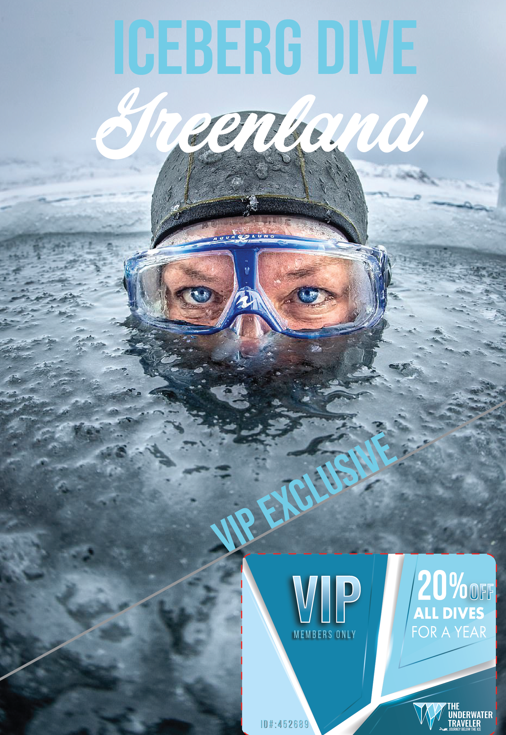
Above is the what the card looks like when folded. Below is the card when unfolded.
